Luxury homeowners can benefit from choosing colors for every room when they combine aesthetics and science.
Primary colors (i.e., blue, red and yellow) remain among the perennial choices for rooms. In particular, most people choose different shades of blue because of its soothing effect.
Not every room, however, needs to radiate calmness. If you have a home office, the National Association of Realtors (NAR) cited a study about the cognitive benefits of using red in certain rooms.
As it’s a vibrant color, red helps with improving attention span and mental performance.
It might be time to repaint the walls when you constantly struggle to concentrate while working from home. Here are the best colors for every room based on science.
When it comes to the bathroom, blue hues often make an ideal pick.
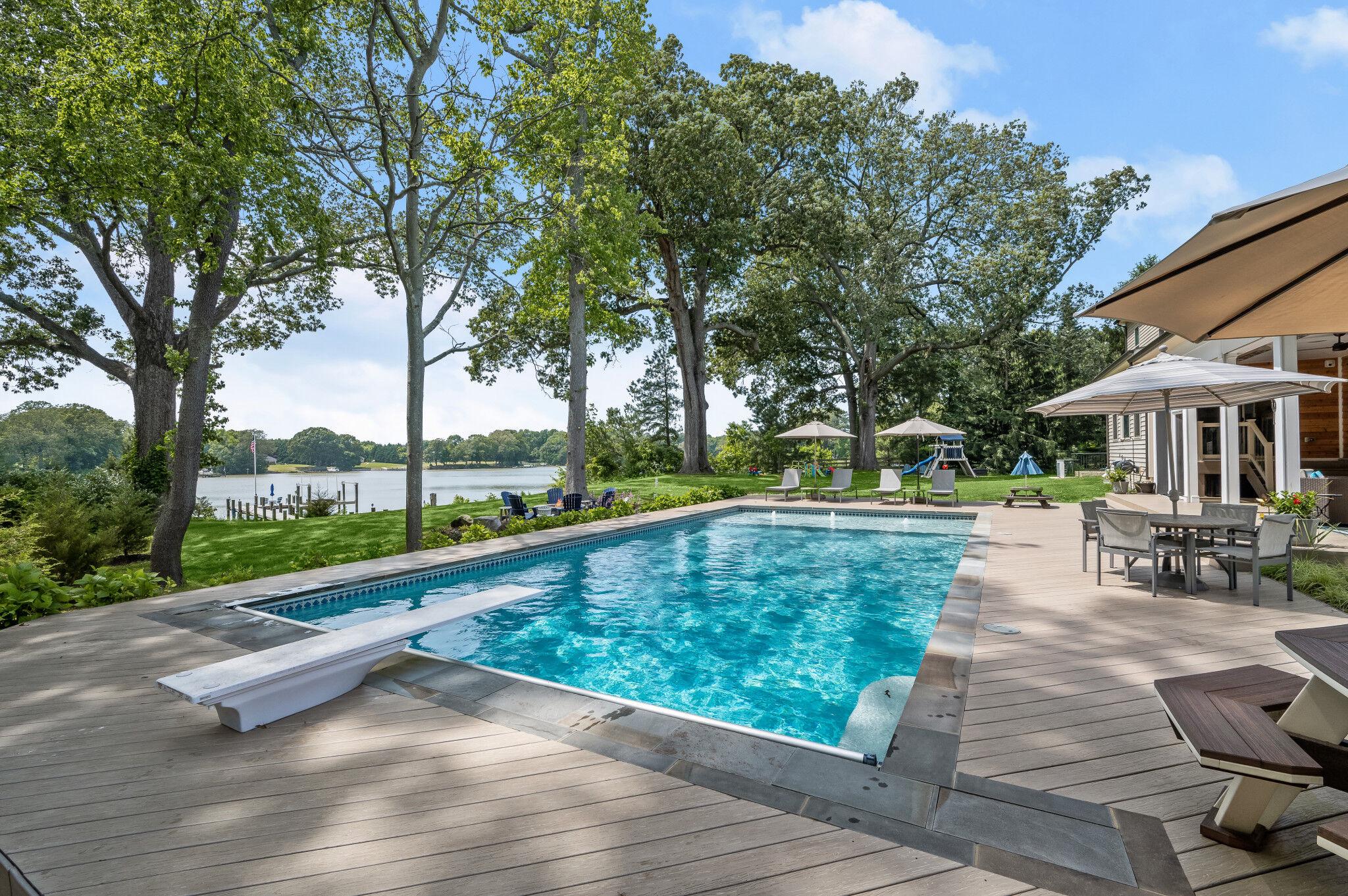
Bathroom
While blue works in almost any part of the house, you should pick one based on its shade. Sky blue works best for bathrooms due to its calming effect, as opposed to neon blue.
Are you unable to recall a specific shade of blue? You’re not alone. A John Hopkins University study showed that humans can only distinguish a few shades of a specific color. For this reason, it’s important to consult a professional interior designer.
If you want to feel happy while taking a shower, choose a warm yellow shade. The color captures the essence of sunshine, so it’s associated with happiness.
Neutral colors for the bathroom include beige, cream, gray and white. These colors are perfect for staging a home, although take care to strike a balanced color scheme.
Otherwise, the bathroom will look dull and unappealing to the eyes.
Warm colors such as green are recommended for bedrooms spaces. One color to avoid: red.
Bedroom
Luxury homeowners shouldn’t use red for the bedroom, and this also applies to accents and furniture.
Unless you want a room that conveys stiffness, red increases anxiety levels and body tension in enclosed spaces.
The Sleep Foundation recommends warm colors such as green for the bedroom. Green can put you at ease before winding down for the day.
You don’t have to repaint the walls just to achieve a relaxing effect. A new set of bedding or even just a well-positioned rug can create a significant difference.
Couples who want to be more intimate should also use green accents in the bedroom. The psychology of green often involves nature and freshness, but it’s also associated with fertility.
The color red is a popular choice for dining rooms for reasons beyond what can be seen by the naked eye.
Dining Room
Did you know that red can increase your appetite because of a higher metabolism rate? It’s no wonder why many fast-food chains use this color in their restaurant layouts.
The next time you prepare a feast, consider using red to stir your guests’ appetite. Don’t overdo it, though, as red can also induce stress.
By contrast, homeowners on a strict diet should use Baker-Miller Pink because of its appetite-suppressing quality.
John Hopkins University’s Health, Weight, and Stress Clinic analyzed the impact of Baker-Miller Pink on almost 1,700 subjects. It showed that the color produced “a peculiar appetite suppression effect.”
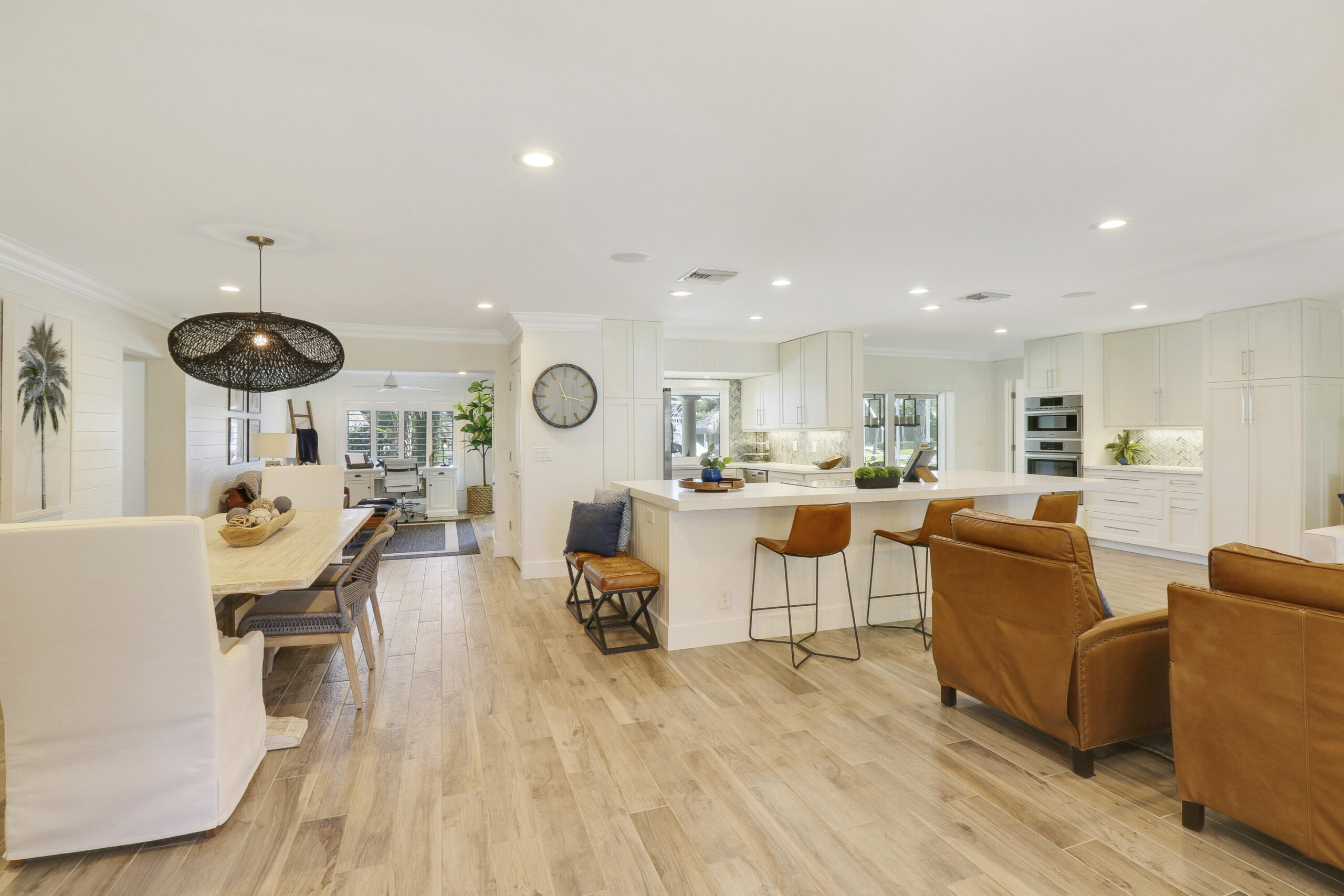
The best color schemes for cooking aficionados include blue, green and yellow hues.
Kitchen
You may also want to use Baker-Miller Pink to prevent yourself from snacking in the kitchen.
On the other hand, the best color schemes for cooking aficionados comprise blue, green and yellow.
Blue may be a calming color, but it also fosters creativity and relaxation. Green emits a feeling of coziness and safety.
While yellow represents happiness, it also contributes to an energetic vibe around the kitchen.
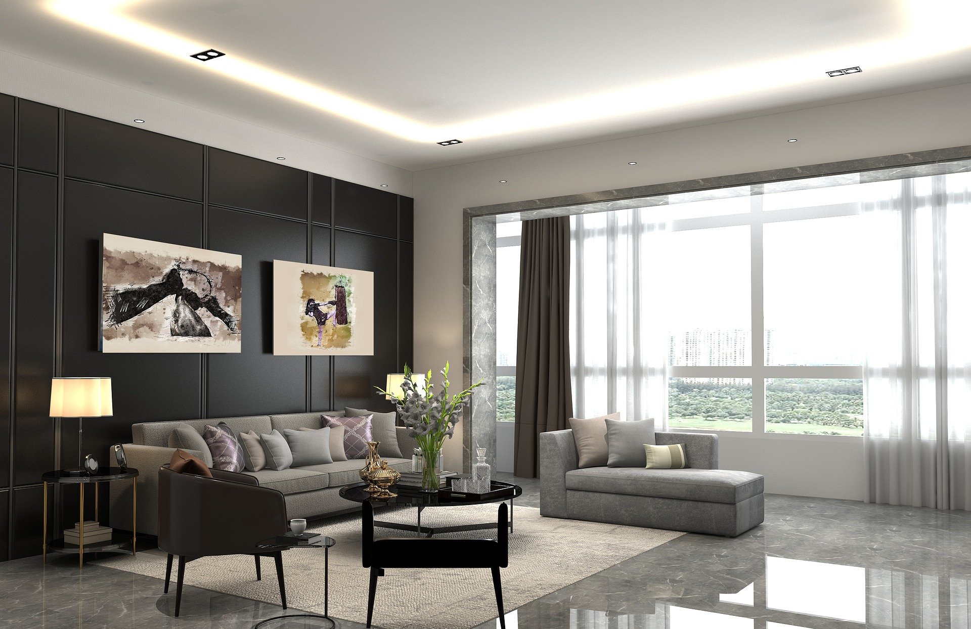
For a bold look in the living room, try a darker hue or even a shade of black.
Living Room
Almost every color scheme works in the living room except for orange. The NAR’s survey of 400 homeowners revealed orange as the least popular choice for paint colors.
Surprisingly, though, red and green also ranked among the least desirable choices for paint colors.
If you’re determined to use a bold and vibrant shade for the living room, think about the general theme beforehand.
Do you want to create a comforting space for happy and relaxed conversations? There’s a reason why it’s called a living room, so your color choice should reflect a lively atmosphere
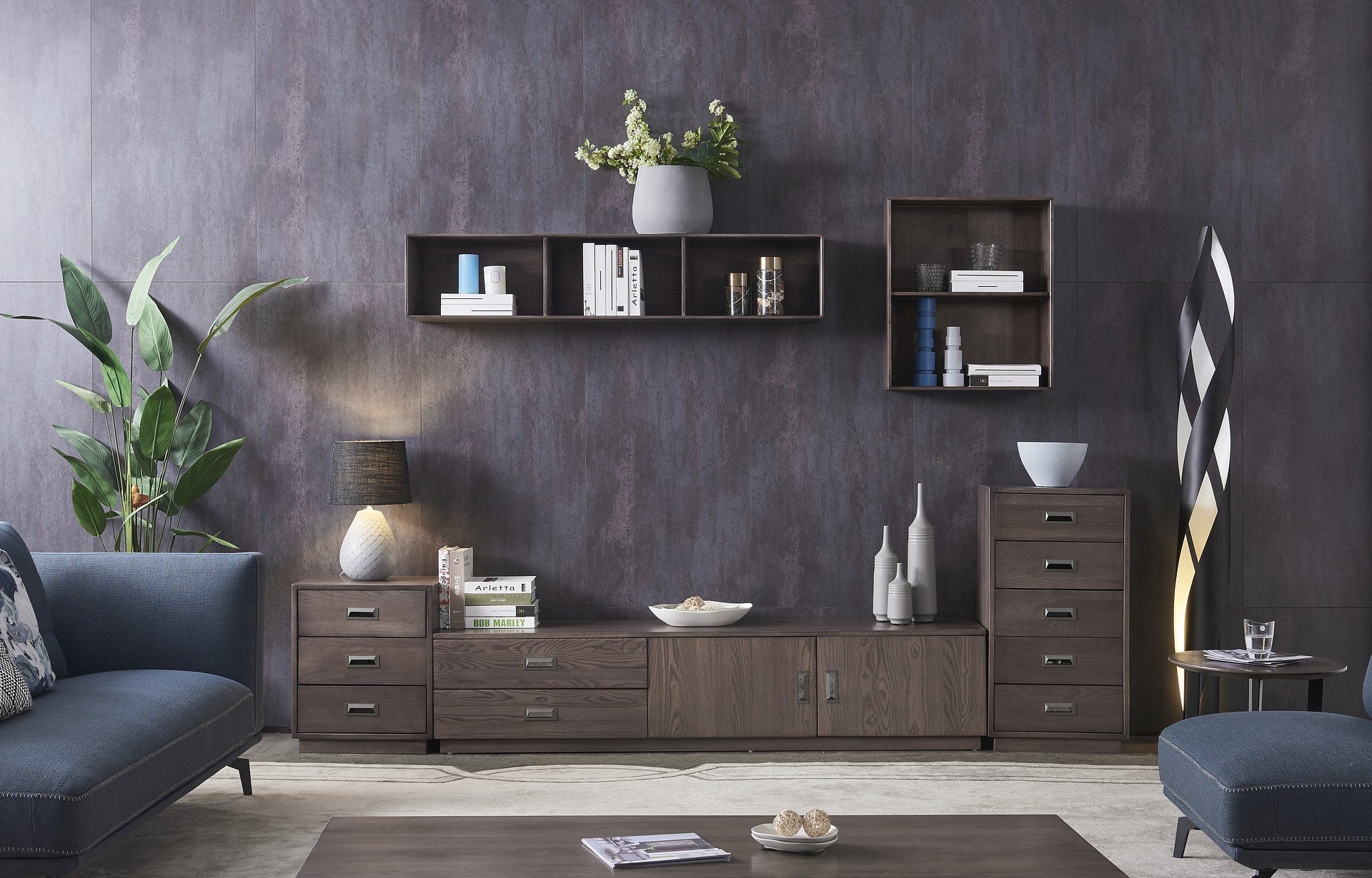
Furniture and accessories make for great accent or complementary pieces.
Colors Beyond Flooring And Walls
Your color choices for every room should extend beyond flooring and walls. Science dictates that using accents and pieces of furniture can help with achieving your desired color scheme.
While personal color choices aren’t debatable, it’s a different story when staging a luxury home for sale.
Click here to choose among curated brokers that can help with selling a multimillion-dollar property.